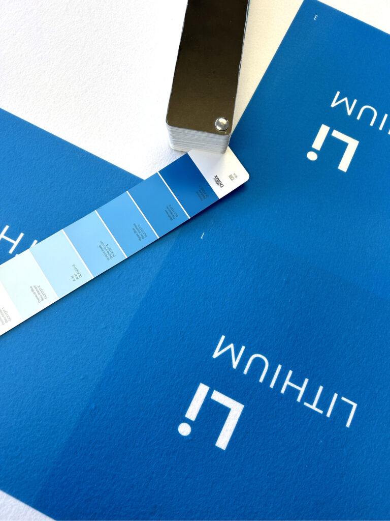
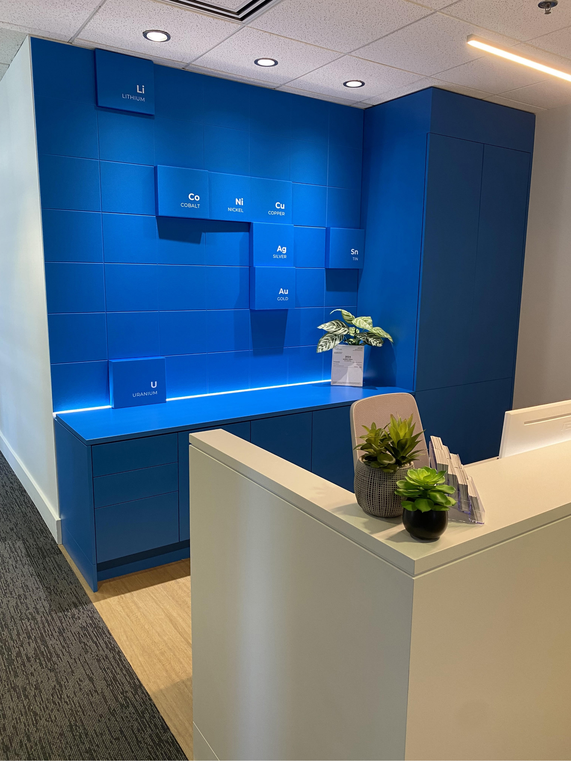
Mak Interiors needed precise colour customization for a design involving a specific blue from Benjamin Moore paint. Hush Acoustics matched this colour in their panels, blending seamlessly with existing millwork. Hush Acoustics' panels and Bold boxes delivered a high-quality colour accuracy, perfectly complementing the original paint.
Year Installed: 2024
Client: MAK Interiors
Location: Vancouver, BC
Situation
MakInteriorshad envisioned a specific design that required precise colourcustomization. Hush Acoustics were among the few companies capable of bringing their vision to life by perfectly matching the requested tone and integrating it seamlessly with their current millwork.
Challenge
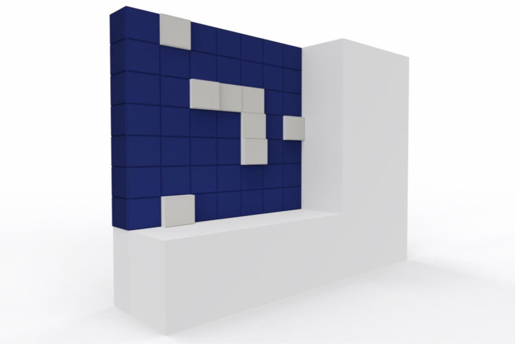
A specific blue from Benjamin Moore paint needed to be blended within the Acoustic panels and the furniture around where the panels would be installed.
Solution
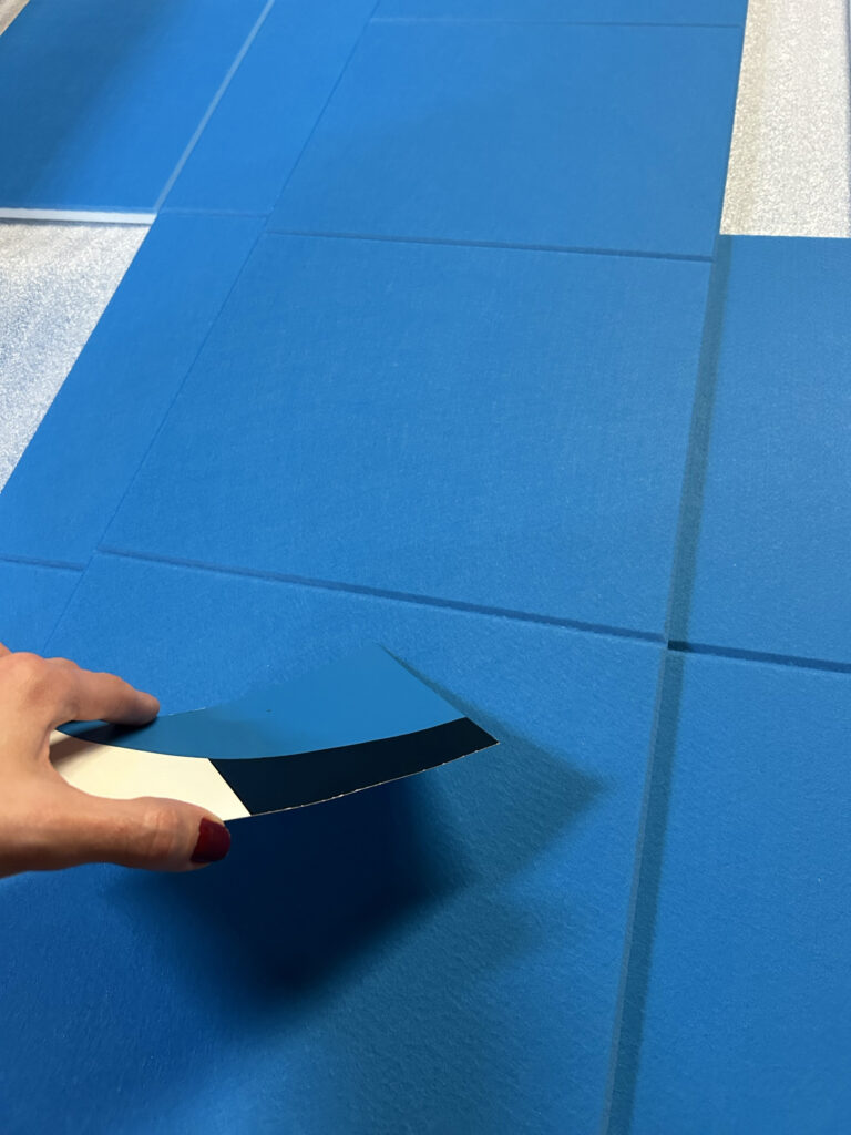
Our design team was able to find the perfect colour combination, having the original tone as a reference. Our panels can capture the richness of colours, the subtlety of gradients, and the fine nuances of textures, delivering a visual feast for the eyes in addition to acoustic properties.
Our acoustic felt has a soft and fibrous touch, it comes with a natural texture, and absorbs ink differently compared to traditional paper, resulting in a distinctively high-quality matte finish. The original Benjamin Moore reference paint was also matte, what contributed to the colour blend between both materials (wood from the milwork, and felt from the Acoustic panels).
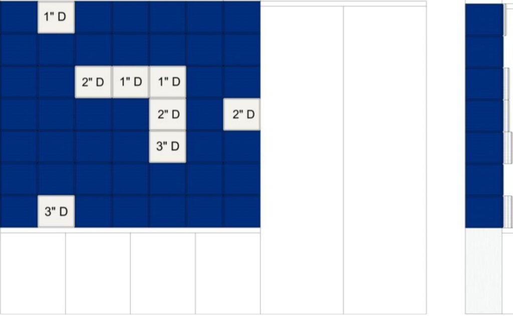
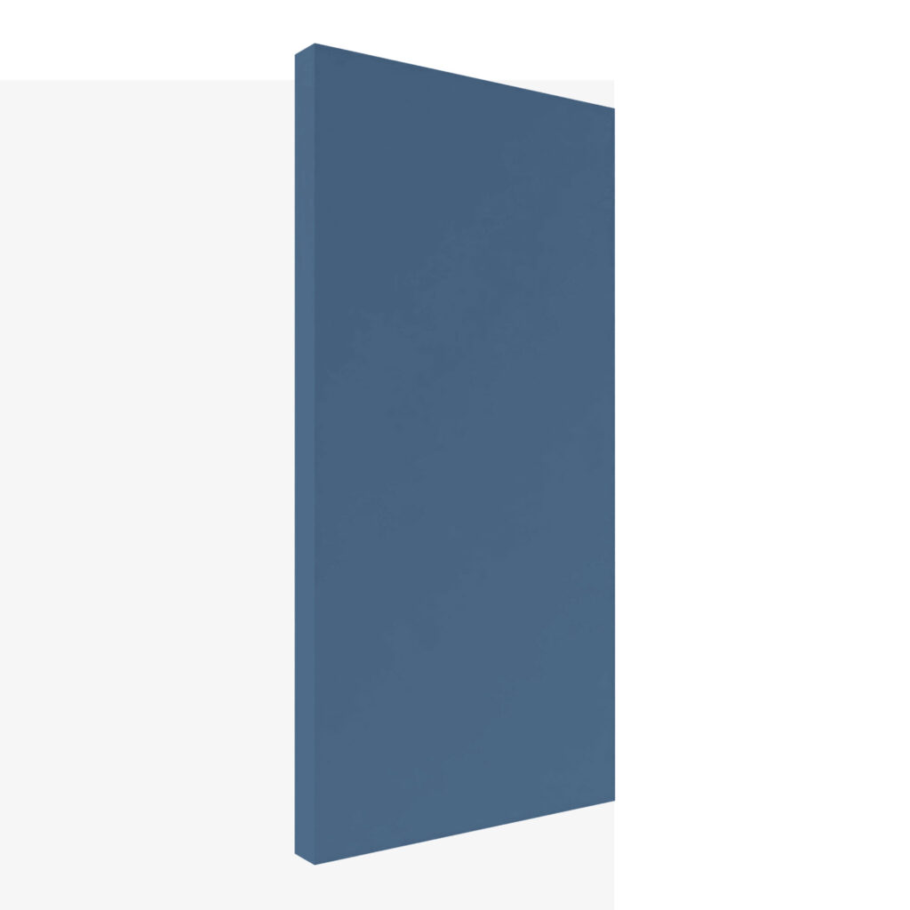
The boxes were designed as Bold panels, with different widths and depths, popping up from the base panel. Originally they were designed to be backlit, and the letters in orange. They were changed to white letters, with no backlit.
More information about Hush Acoustics printing can be found at the Panel Printing Protocol document. Contact our sales team for more information about this and other kinds of customization.